Payment Resiliency
As part of DBS Bank’s response to the Monetary Authority of Singapore’s pause, we were asked to examine the payment journey and provide users with more certainty during system downtime.
I was the Design Lead for the project, working across PayLah! and digibank in 2024. We had a tight timeline and limited design support, while the work required input from Design, Digital, Product Leadership and Technology.
Outcomes
After the feature launched:
PayNow-related inquiry calls fell by 26%.
We received more than 40 positive comments from users.
A promotional TikTok video received more than 700,000 views.
"New interface so much better where the hawkers can see the successful image.”
- User's feedback
Client: DBS
Role: Design Lead
Team: Four designer
Timeline: 2024
Finding the real problem
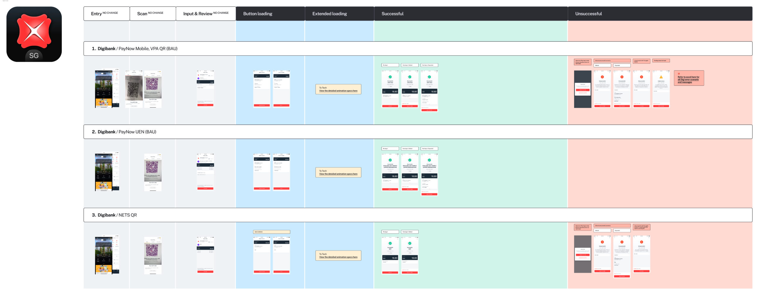
The initial brief focused on payment messaging. Our team mapped the end-to-end journey across PayLah! and digibank to understand where uncertainty was actually coming from.
I focused the investigation on two questions:
1. What was causing the lack of clarity?
2. Where could we improve the experience?
Stakeholder interviews showed that wording was only part of the issue. Some transactions remained in a pending state. During PayNow downtime or server failures, the status recorded by the central system could differ from what a merchant had received: a customer might see a successful payment while the merchant was still waiting for the funds.
The research also surfaced two related needs. Older users had asked for larger text on the completion page, while merchants needed an easier way to check whether a successful payment was genuine.
How might we give users more certainty about their payment while making the experience easier to read and verify?
Designing for the moments that mattered
We addressed the experience across three moments: while a payment was processing, when it was unsuccessful and when it succeeded.
When the payment was successful
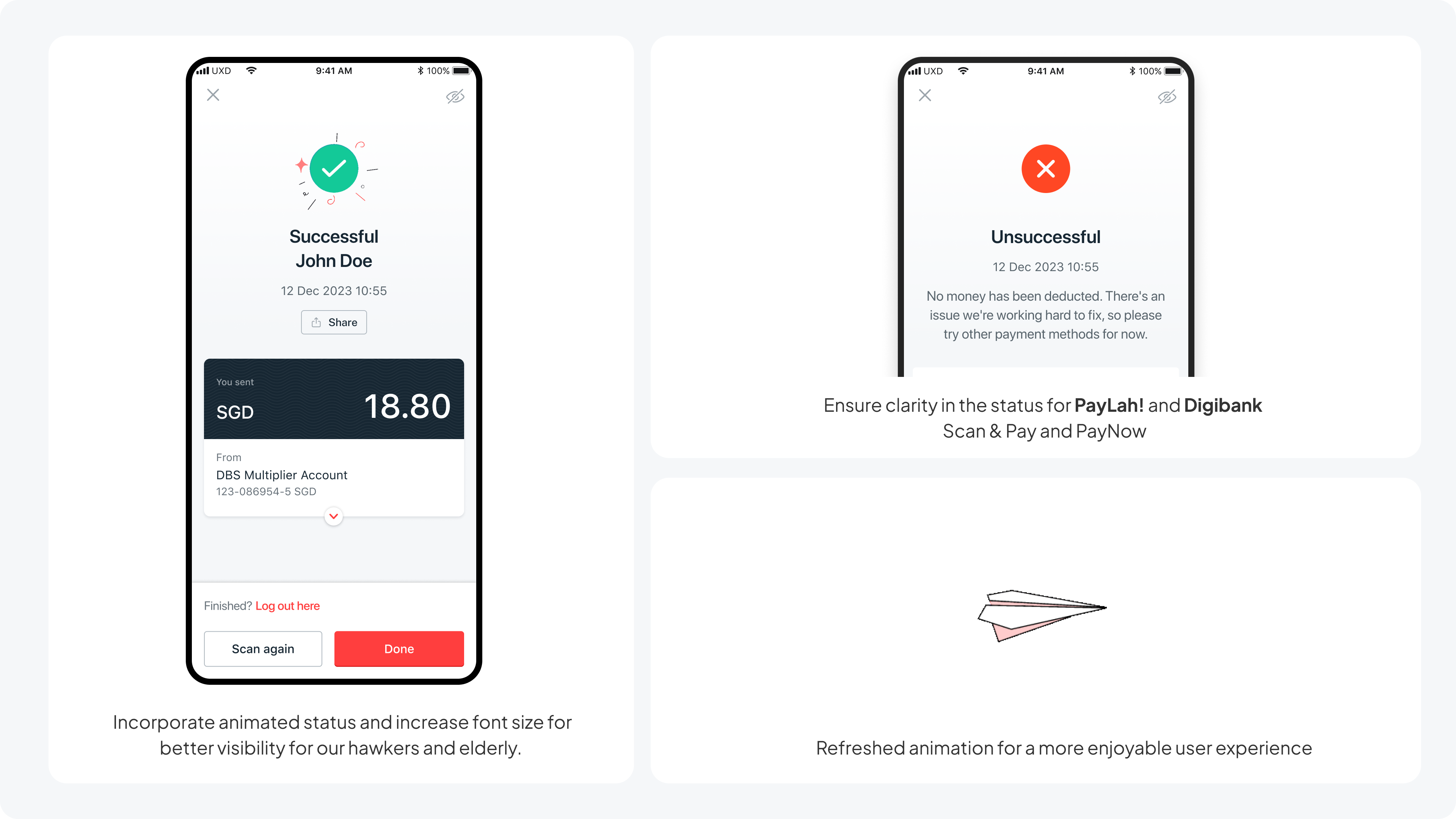
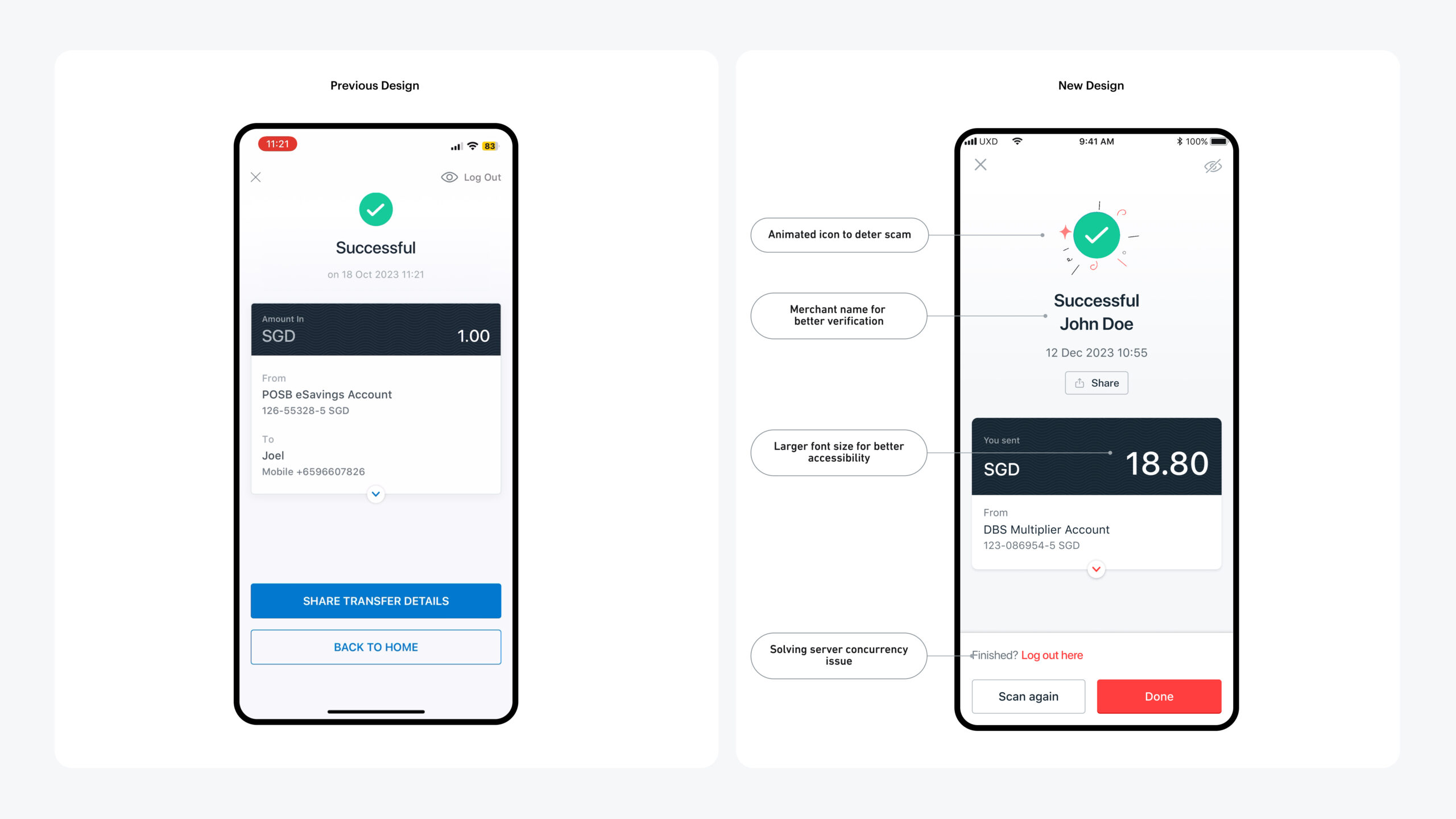
We made the merchant name and amount more prominent and increased the font size. This made the information easier for older users to read and gave merchants the key details they needed when checking a payment.
We also introduced an animated success icon. The animation made the confirmation more visible and was intended to make static screenshots harder to use as false proof of payment.
When the payment was unsuccessful or pending
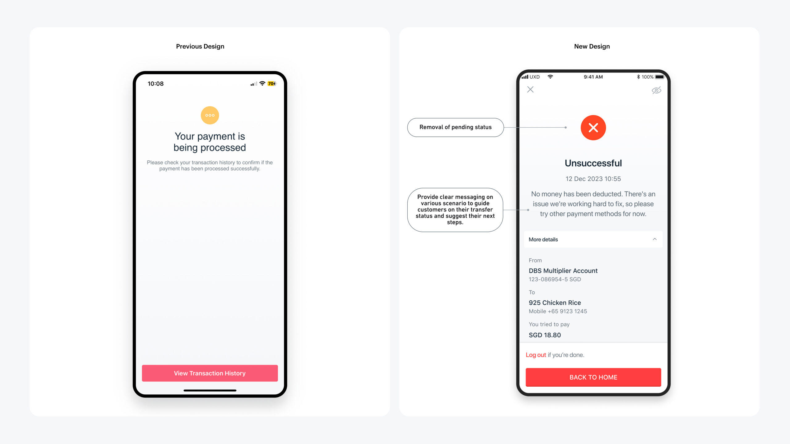
The old experience told users that it was being processed and asked them to check their transaction history. The redesigned screen gave them a direct answer: no money had been deducted, there was an issue and they could try another payment method. We kept the transaction details available in case they needed to refer to them.
While the system was working
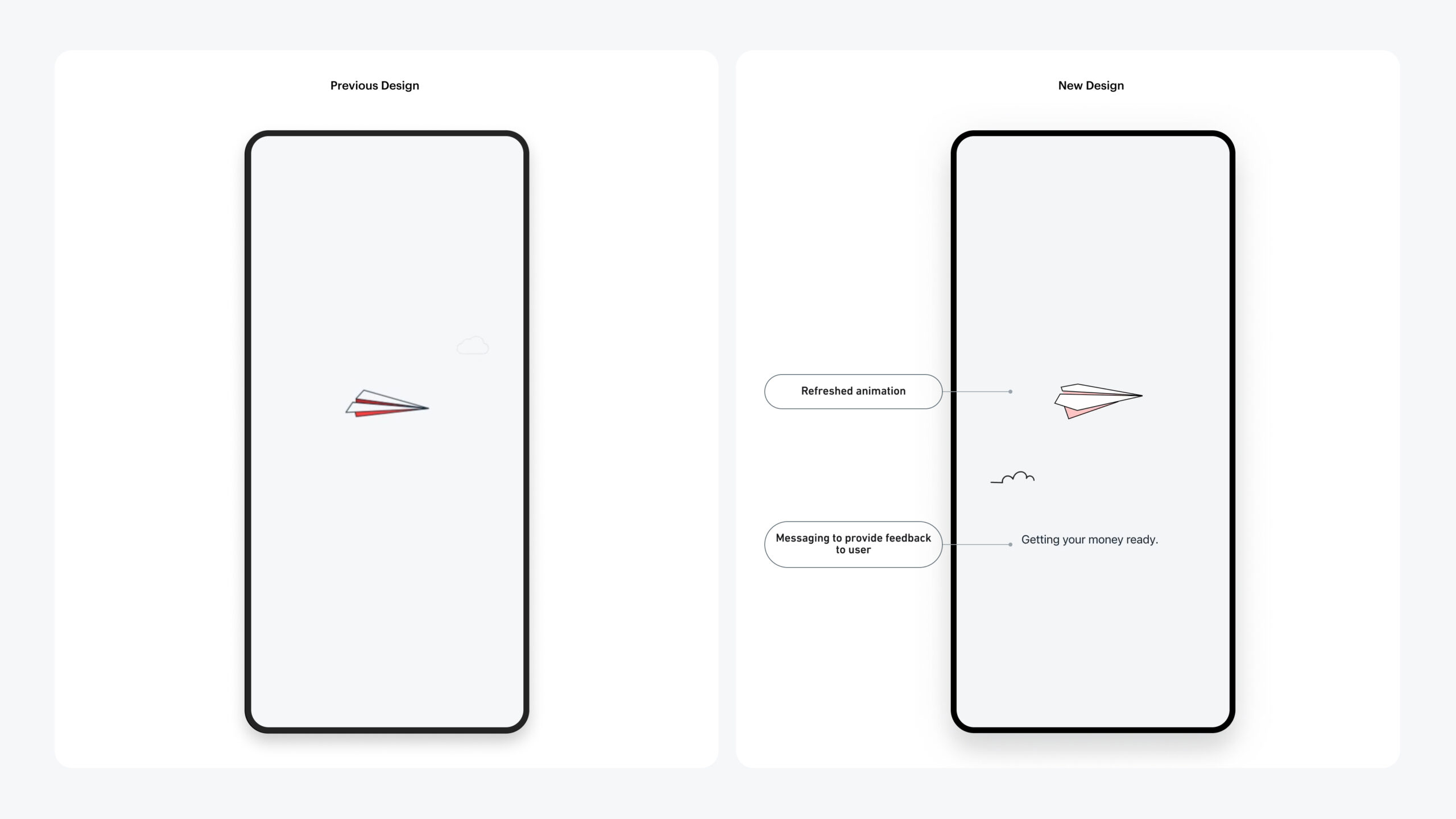
The previous loading screen relied mainly on animation and offered little feedback about what was happening.
We refreshed the animation and added the message, “Getting your money ready,” so users knew the system was still working on their payment.