Client: Citibank Global Experience Design Group
Role: Senior UI/UX Designer
Client: Citibank Global Experience Design Group
Role: Senior UI/UX Designer
Citibank Poland Redesign
Background
We were tasked to revamp Citibank Poland site, starting with the customer's login page. To begin, we had to reimagine how fintech can do more for a user by eliminating the complexity of the process flow and nested function, helping users to complete their task or decision efficiently.
Challenge
Bank products are complex due to legal and legacy issues. We had to understand how their current product worked before designing a solution that will cover all business requirements. Another challenge for this project was redesigning the mobile experience while displaying a large amount of information.
Process
We tackled the section by first identifying the problems, diverged with explorations before converging with the right solution. We ran multiple user testings at the end of the sprint to get valuable feedbacks and iterated the design until it met all needs.
The Result
The launch of the new platform was well received. Within just a couple of days of launch, over 92 thousand customers had logged in, but only 2% reverted to the former design. It received positive feedback from users and was featured in several Poland finance sites.
Citibank Poland Revamp
Background
We were tasked to revamp Citibank Poland site, starting with the customer's login page. To begin, we had to reimagine how FinTech can do more for a user by eliminating the complexity of the process flow and nested function, helping users to complete their task or decision efficiently.
Challenge
Bank products are complex due to legal and legacy issues. We had to understand how their current product worked before designing a solution that will cover all business requirements. Another challenge for this project was redesigning the mobile experience while displaying a significant amount of information.
Process
We tackled the section by first identifying the problems, diverged with explorations before converging with the right solution. We ran multiple user testings at the end of the sprint to get valuable feedbacks and iterated the design until it met all needs.
The Result
The launch of the new platform was well received. Within just a couple of days of launch, over 92 thousand customers had logged in, but only 2% reverted to the former design. It received positive feedback from users and featured in several Poland finance sites.
Dashboard
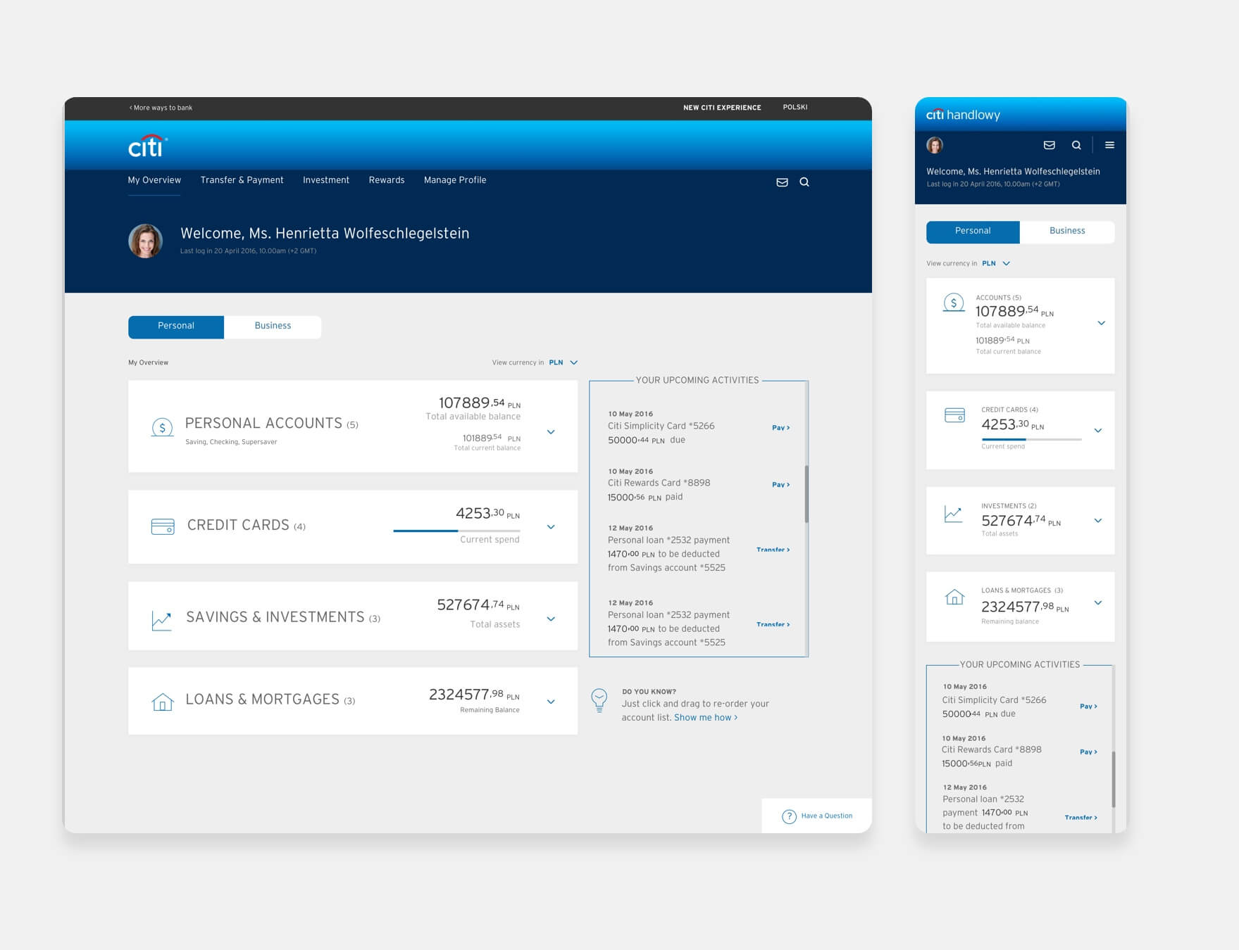
The dashboard offers a clean and uncluttered design, giving users quick access to crucial information. Features like upcoming activities help users to keep track of their payment and transfer.
Dashboard
The dashboard offers a clean and uncluttered design, giving users quick access to crucial information. Features like upcoming activities help users to keep track of their payment and transfer.
Manage Card
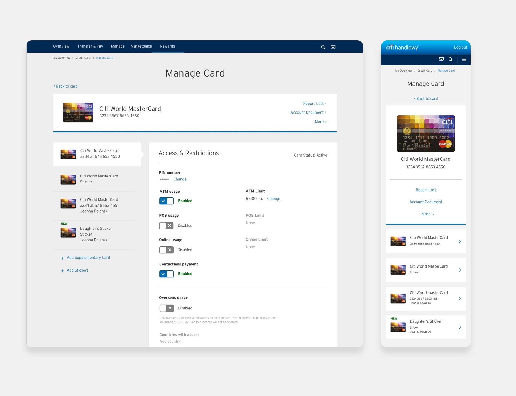
A simplified 'Manage Card' section where users can have a overview of their cards. Users are also able to dive deeper into individual cards to edit their card settings.
Manage Card
A simplified 'Manage Card' section where users can have a overview of their cards. Users are also able to dive deeper into individual cards to edit their card settings.
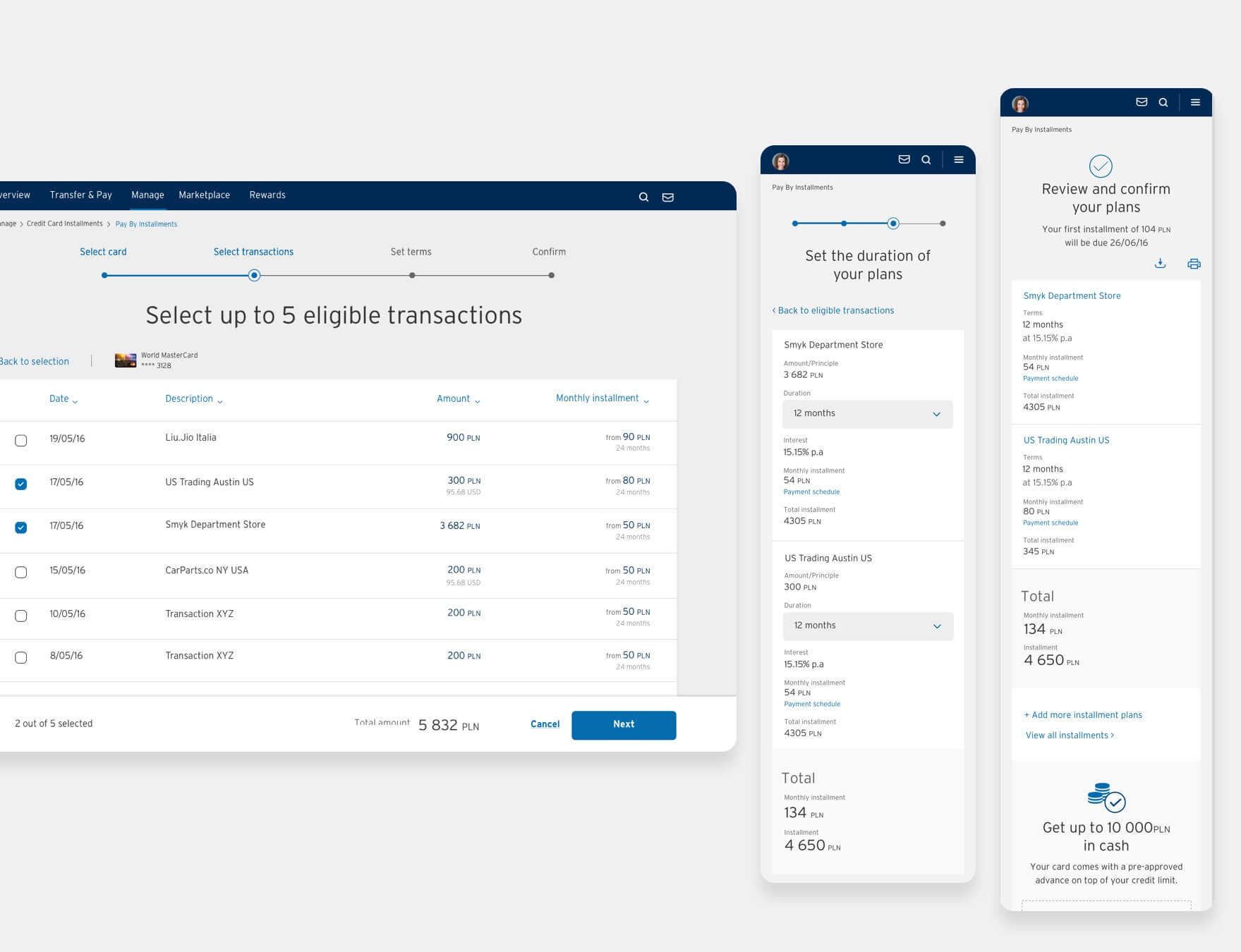
Instalment
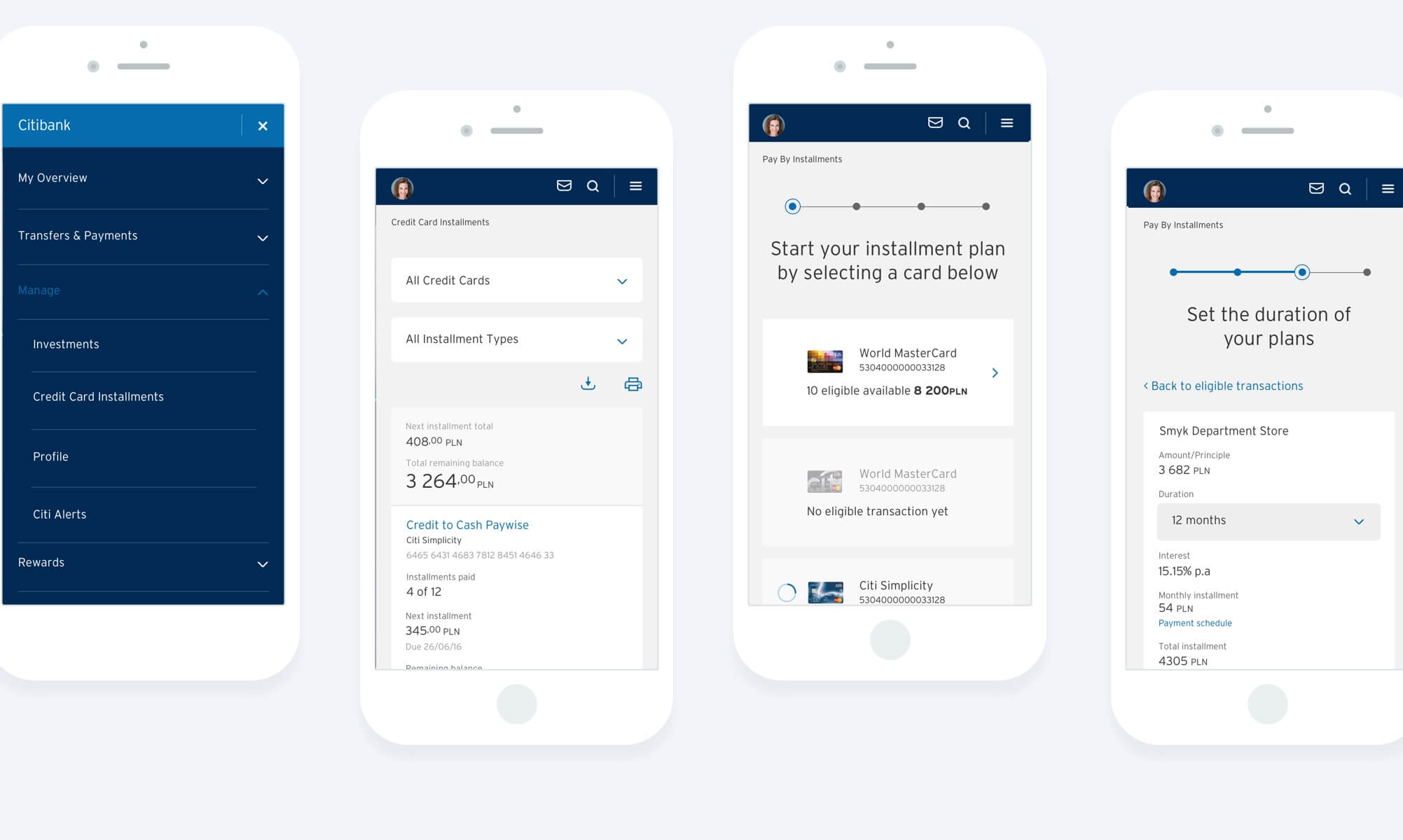
A smart instalment payment process that lists transactions which are eligible for payment by instalment. This greatly shortens the lengthy process of getting a instalment.
Instalment
A smart instalment payment process that lists transactions which are eligible for payment by instalment. This greatly shortens the lengthy process of getting a instalment.
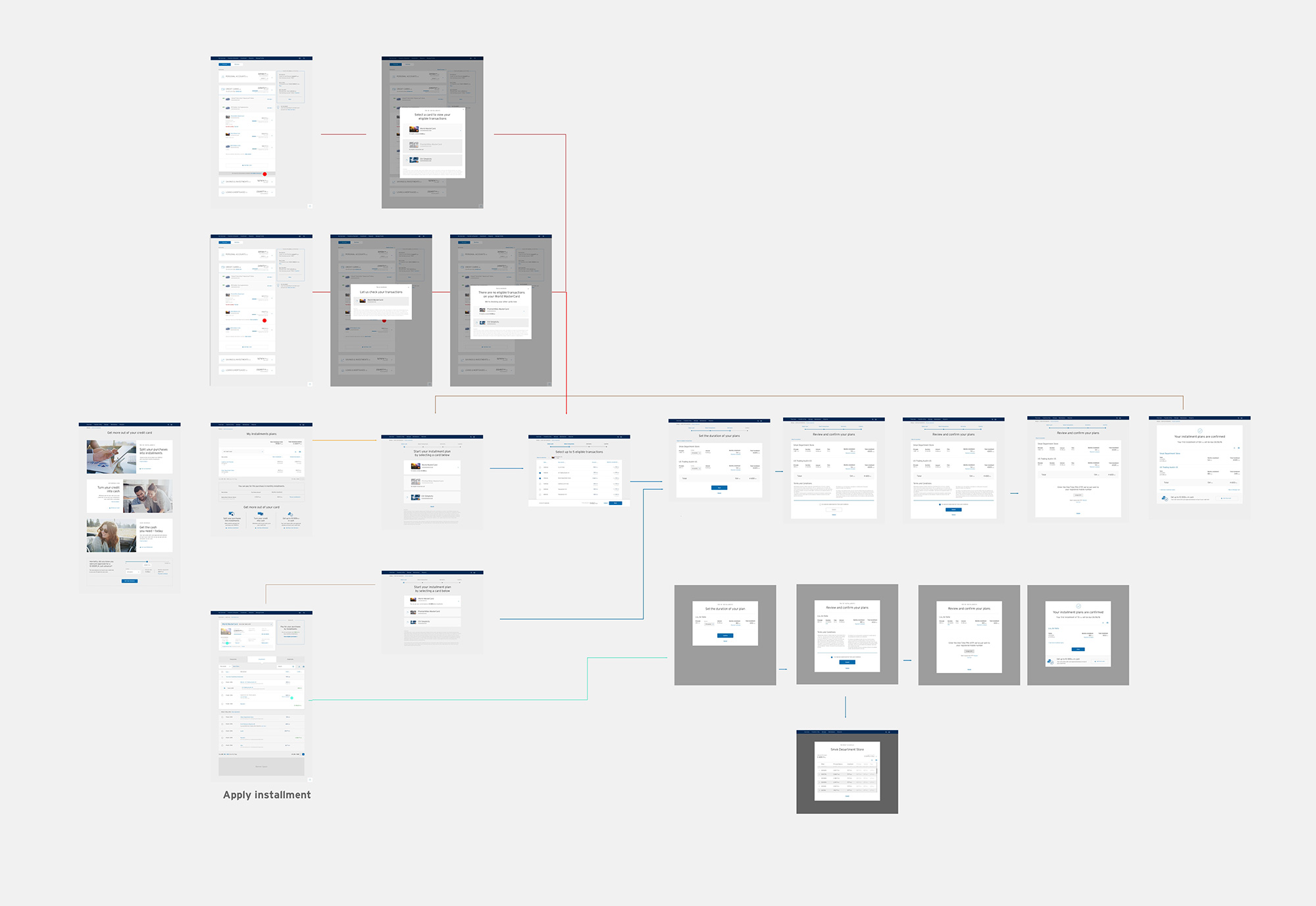
Instalment process flow
When designing a flow, we had to keep in mind the different ways a user can land onto the process. This is to ensure that the process flow we designed are rid of unnecessary processes and steps for the user, and yet still meeting business requirements.
Click image to view larger
Next project
Next project
All Right Reserved. Joel Sow 2019

